 WORXMATE
Quick Answer
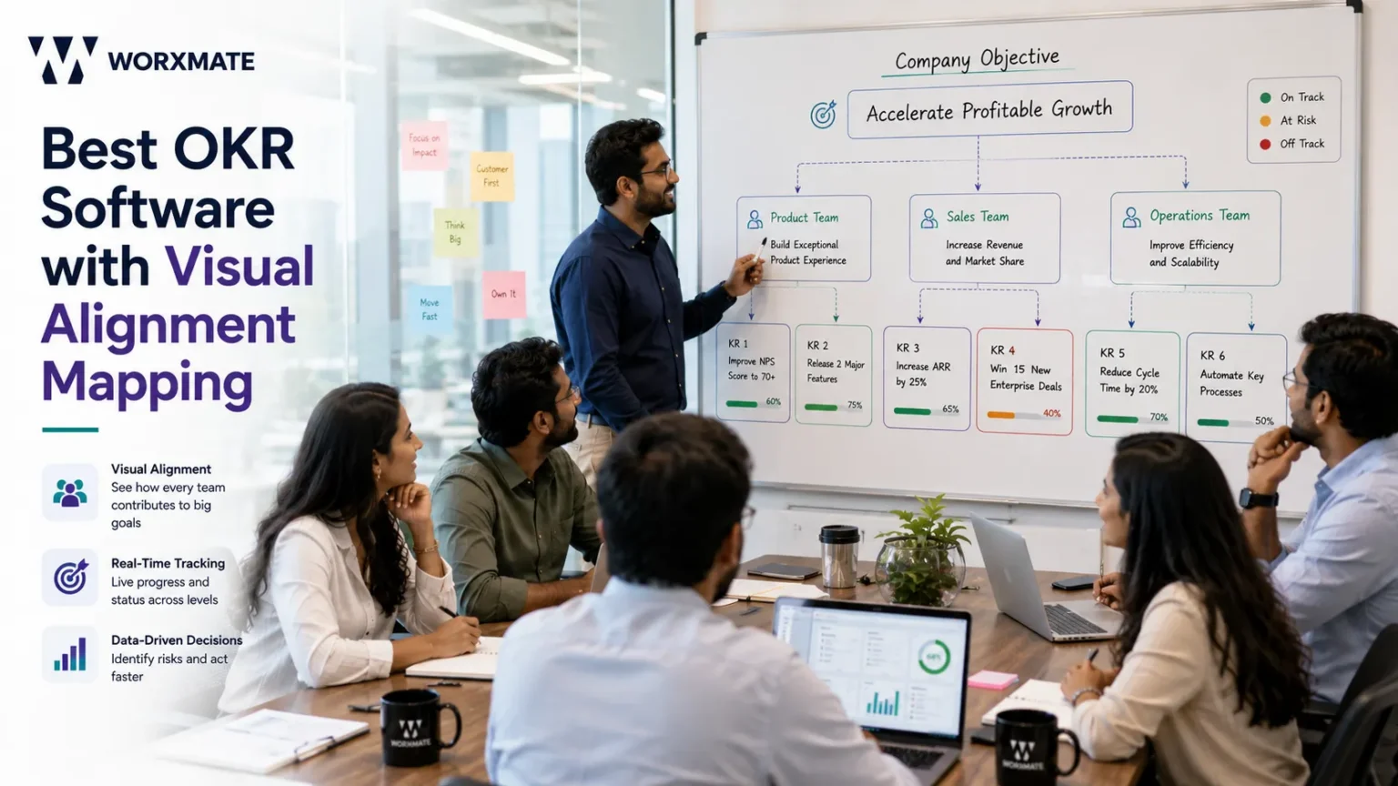
The best OKR software with visual alignment mapping shows every team and individual goal connected to company objectives in one live view cascade, dependencies, ownership, and at-risk signals included, not stitched together from spreadsheets and slide decks. Worxmate pairs visual alignment mapping with its DEEP AI™ execution framework and three AI intelligence layers – Orbit, Axis, and Nexus, so alignment is visible in week one of your first cycle, not discovered as a gap in month three.
The problem with most “OKR software”
A leadership team sets ambitious quarterly OKRs. Departments cascade their own. Three weeks in, a CHRO asks a simple question in a review: “How does the recruitment team’s OKR actually support the employee retention objective?” Nobody in the room can answer without opening four different documents.
This is the most common failure mode across implementations, and it’s rarely a discipline problem it’s a visibility problem. Alignment gets declared in a kickoff meeting, then quietly lost, because most OKR tools store goals in a list, not a structure. You can filter and search, but you can’t see how one goal holds up another. Why OKR implementation fails almost always traces back to this gap, not to bad goal-writing.
The deeper issue: you cannot set alignment in a tool. You can display it. You cannot create it. A visual map doesn’t manufacture alignment that was never negotiated it exposes whether that negotiation happened. That’s also why cross-team alignment keeps breaking even with expensive software: the tool was asked to do a conversation’s job.
What is visual alignment mapping in OKR software?
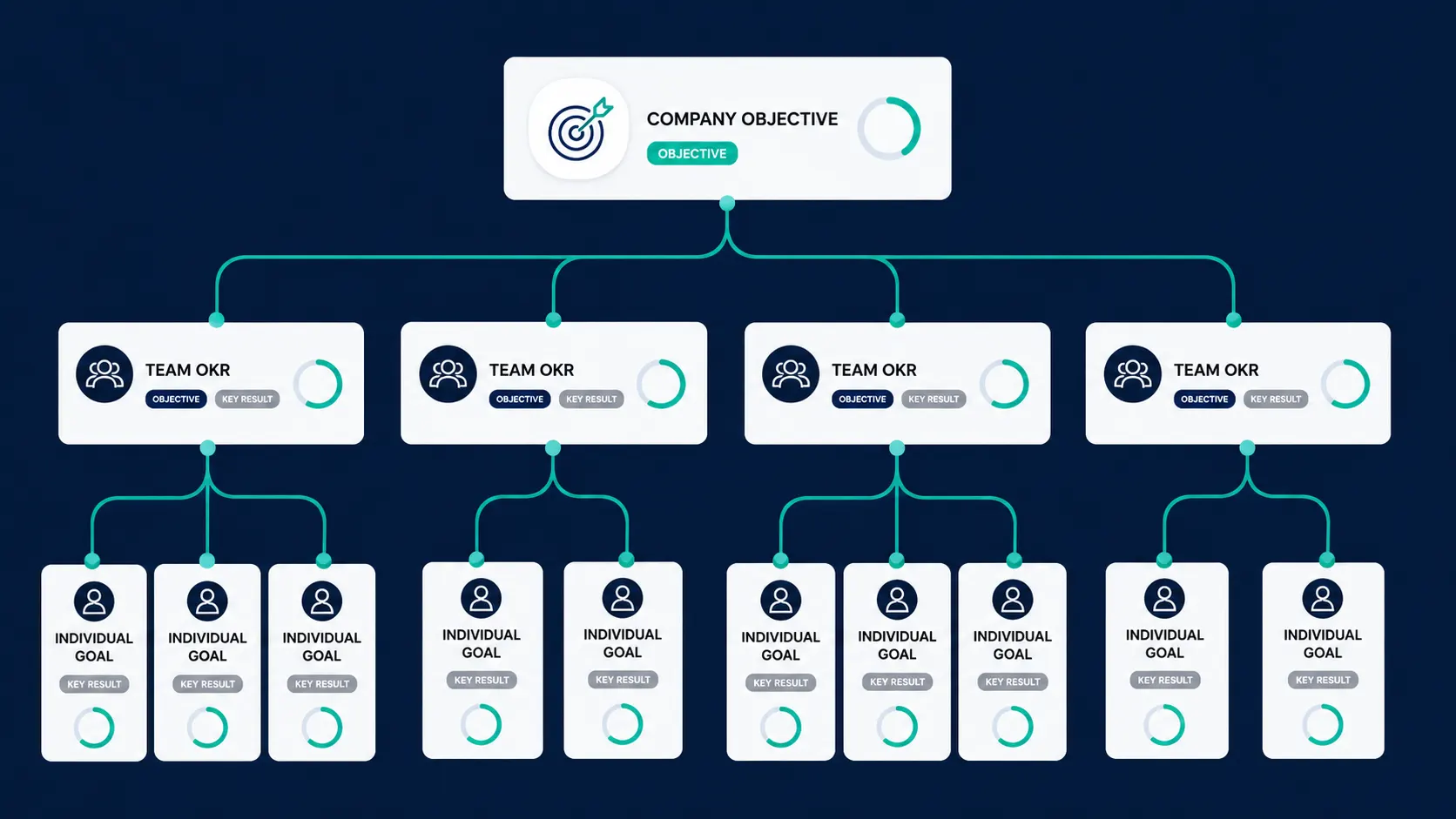
Visual alignment mapping is a live, structural view of how every objective in the organization connects company-level down to individual contributor rendered as a navigable map instead of a flat list or a static slide. Instead of reading alignment in a document or trusting a quarterly cascade diagram someone built in PowerPoint, teams see:
| What the map shows | What it replaces |
|---|---|
| Cascade — which team OKRs ladder into which company objective | A slide deck rebuilt every quarter |
| Dependencies — where one team’s key result blocks another’s | Cross-team Slack threads and guesswork |
| Ownership — who is accountable for each node | A separate RACI spreadsheet |
| At-risk signals — where progress is stalling early | Discovering the miss in the quarterly review |
This is different from OKR alignment as a principle how goals are written and negotiated and closer to goal alignment made operational: a live artifact, not a one-time exercise. As an OKR strategy map, it’s structurally different from most OKR cascading software, which shows a static hierarchy rather than a live, risk-aware view.
Achieve Your Goals Faster
See how Worxmate can help your team set clear goals and achieve faster results. Book your free demo today and experience the power of AI-driven OKRs in action.
Best OKR software features you need beyond alignment mapping
Alignment mapping is the differentiator, but it doesn’t work in isolation. The best OKR software pairs it with infrastructure that keeps the map accurate week over week, not just accurate on the day it was built.
It sits inside Worxmate’s DEEP AI™ framework (Define, Execute, Evaluate, Plan) as the connective layer across all four stages, each its own product feeding the map automatically
| DEEP AI™ Stage | Worxmate Product | What It Feeds Into the Map |
|---|---|---|
| Define | AI OKR writing tool | New goals inherit their cascade position automatically |
| Execute | OKR check-in software | Keeps every node’s status current, not stale |
| Evaluate | OKR scorecard software | Flags vanity progress before it reaches a board deck |
| Plan | OKR retrospective tool | Turns each cycle’s map data into next-cycle fixes |
This is what separates a genuine OKR alignment map from OKR software for enterprise alignment that only displays structure — it’s a live output of four connected products, not a static picture.
Structured OKR check-ins keep the map live instead of a stale planning-day snapshot, and OKR dashboards in real time matter because week-old data misleads more than it clarifies. Tool integrations with Jira, Slack, and Microsoft Teams round this out the map should reflect where execution actually happens.
Still deciding whether OKRs or KPIs are the right metric to map first? Read when to use KPI vs OKR and KPI to OKR conversion first a map of the wrong metric structure just makes the wrong structure easier to see.
How Worxmate’s visual alignment mapping works
Most “strategy maps” in competing tools are a visual layer bolted onto a goal-tracking database a diagram that renders what’s stored, nothing more. Worxmate’s alignment mapping is built on top of three distinct AI intelligence models, each reading a different failure mode into the map itself:
Orbit AI: Worxmate’s employee performance intelligence software — surfaces where an individual’s overload or disengagement is quietly weakening a node in the map, often 4–8 weeks before it would show up in a formal review.
Axis AI: Worxmate’s business performance intelligence software — reads the map for the fastest lever to pull when a business outcome, like revenue, is falling behind, instead of leaving leaders to guess which of a dozen disconnected KRs matters most.
Nexus AI: Worxmate’s organisational intelligence software — maps structural misalignment and cascade breaks at the organizational level, catching the pattern before it stalls an entire quarter, not after.
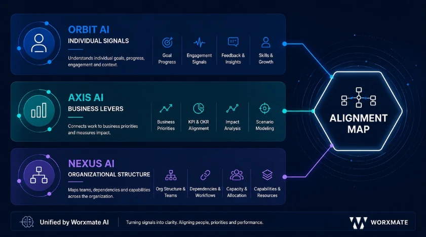
That’s the practical difference between a static strategy diagram and a visual OKR tool that’s actually intelligent: it doesn’t just show the structure you built — it tells you where that structure is already failing.
Best OKR software vs. other alignment tools
Not every tool calling itself “OKR software” belongs in this comparison. HRIS platforms with a goals module bolted on the Zoho People and Darwinbox category treat OKRs as one feature among many. For dedicated OKR alignment software, OKRs are the entire product; every engineering decision is built around one question: does this make execution better. That singular focus is what produces real cascade architecture instead of a checkbox goals tab.
Among purpose-built OKR tools, three names come up most often when evaluators are specifically comparing alignment and strategy-mapping capability: Perdoo, Quantive, and Tability. Here’s how each actually holds up.
1. Perdoo
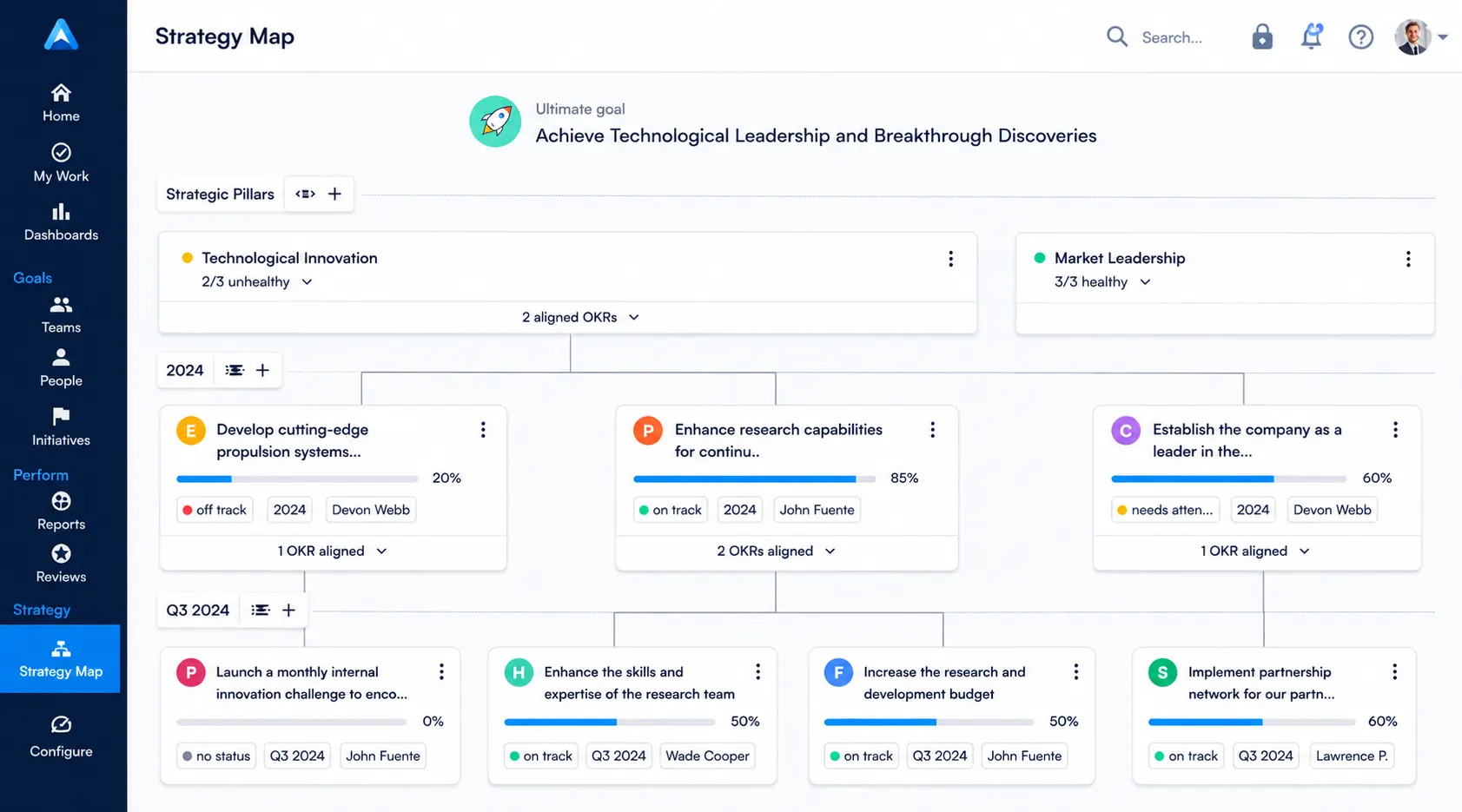
Perdoo’s core strength is its strategy map combined with an OKR + KPI framework in a single view you can see time-bound objectives and ongoing health metrics side by side, which few competitors do cleanly. It’s one of the more established names built specifically as an OKR strategy map tool, not a check-in tool with a map bolted on afterward, and that shows in how deep the mapping goes: you can trace a key result down through multiple organizational layers without losing the thread.
It’s a genuinely strong fit for organizations that are already past the adoption curve teams that understand OKR discipline, have run at least one or two cycles elsewhere, and want a mature strategy-mapping layer on top rather than a tool that teaches OKR fundamentals along the way. Mid-market and strategy-heavy organizations tend to get the most value here, particularly ones that already track KPIs separately and want a single home for both.
Where it struggles is the interface reviewers consistently describe it as functional but dated, which slows onboarding for teams new to OKRs and adds friction during the first few cycles. It also assumes a level of strategic maturity in the setup process; if your organization is still building basic OKR habits, Perdoo’s strategy map can feel like a feature you’re not ready to use yet, rather than a feature that helps you get there. Full breakdown: Worxmate vs Perdoo.
2. Quantive
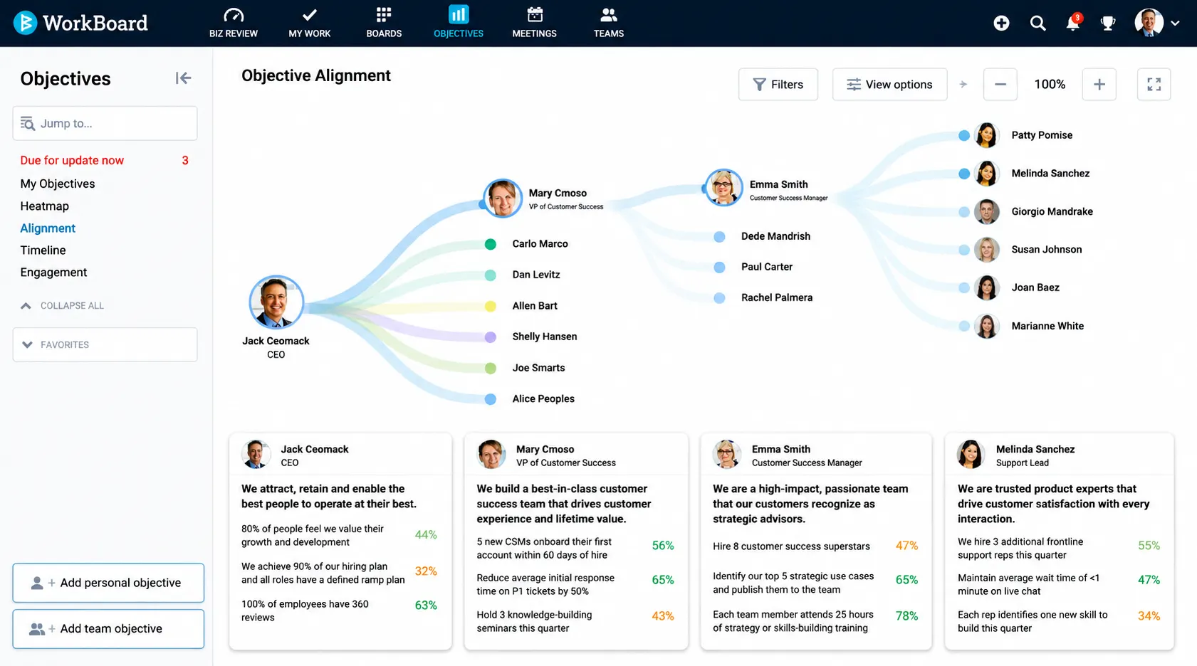
Quantive (formerly Gtmhub) is built for data integration at scale it pulls from more external systems than most competitors and rewards organizations with the analytics maturity to use that depth. It’s positioned less as simple OKR cascading software and more as a full strategy-execution platform, with configurable hierarchies that can model complex matrix organizations, multiple business units, and layered reporting structures most tools don’t attempt.
For a 2,000+ person enterprise with a dedicated RevOps or strategy team, Quantive’s configurability is a genuine advantage — it can be shaped to match almost any existing org structure, and its data pipelines mean the alignment view can pull from systems well beyond the OKR tool itself. This makes it one of the stronger options when the requirement is OKR software for enterprise alignment across genuinely large, distributed organizations.
For a first-time OKR implementation, though, it’s the wrong starting point. The configuration overhead before a first cycle runs is significant often weeks and the platform’s power is wasted, sometimes actively confusing, for teams that haven’t yet established basic cascade discipline. It’s a tool you grow into, not one you start with. Full breakdown: Worxmate vs Quantive.
3. Tability
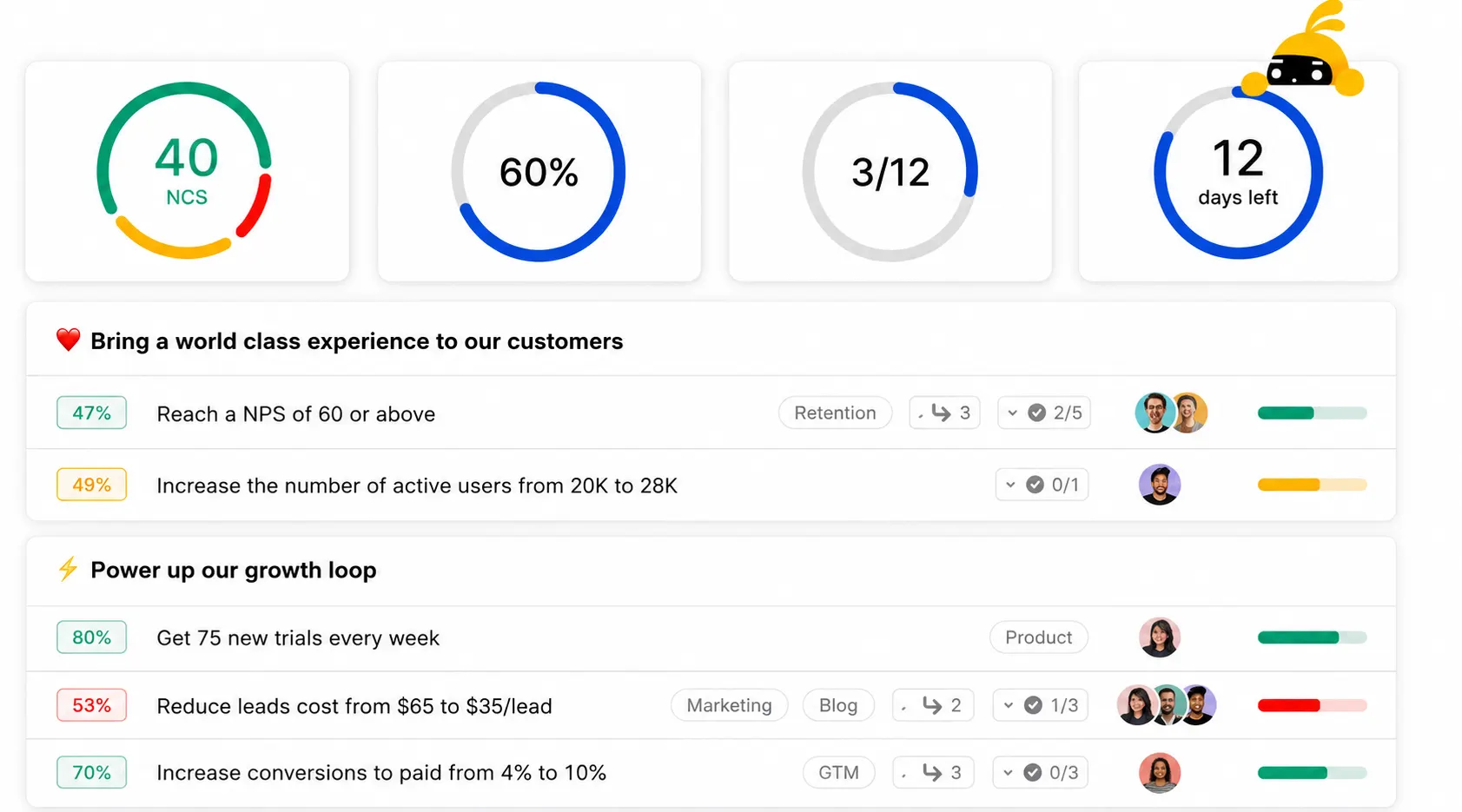
Tability has arguably the best automated check-in infrastructure in the category reminders, habit-building nudges, and a lightweight update flow that genuinely solves the “nobody updates their OKRs” problem better than most tools on this list. Where most cascading OKRs software treats check-ins as an afterthought bolted onto the map, Tability treats the update habit as the primary product, which is precisely why it’s popular with smaller, fast-moving teams that don’t yet need a heavy strategy layer.
For teams whose primary pain point is inconsistent check-ins rather than structural misalignment, it’s a strong, fast-to-adopt choice setup is quick, the interface is lightweight, and teams tend to actually use it in week one rather than abandoning it after the novelty wears off, which is a real and common failure mode with heavier platforms.
Its limitation shows up at scale: cascade depth is shallow compared to Perdoo or Quantive, and the OKR alignment map view doesn’t hold up once an organization needs to trace dependencies across multiple business units rather than a single team or department. Organizations tend to outgrow Tability’s alignment view within two cycles once they need genuine strategy mapping. It solves the reminder problem, not the structural visibility problem. Full breakdown: Worxmate vs Tability.
Side-by-side comparison
| Tool | Alignment Strength | Best Fit | Main Limitation |
|---|---|---|---|
| Worxmate | Live map + 3 AI intelligence layers (Orbit, Axis, Nexus) | First-time to enterprise implementations wanting speed and depth | — |
| Perdoo | Strategy map + OKR/KPI combined view | Strategy-mature orgs past the adoption curve | Dated interface, steep setup for OKR beginners |
| Quantive | Deep data integration, configurable hierarchy | 2,000+ person orgs with a dedicated strategy team | Heavy configuration before cycle one runs |
| Tability | Best-in-class automated check-ins | Teams whose main issue is inconsistent updates | Shallow cascade depth, outgrown within 2 cycles |
If your current process is still a shared sheet with tabs per department, it’s worth reading spreadsheet vs OKR software or OKR software vs ERP goal modules before comparing feature sets the gap between “no map” and “any map” is bigger than the gap between any two mapping tools. For a wider field view, see our top 10 OKR software roundup and OKR tool comparison.
Worxmate’s distinction isn’t a feature claim. It’s a build philosophy: this was built by someone who ran OKR programs and hit these exact failure modes, not by a product team that built software and learned the rest afterward.
[IMAGE PLACEHOLDER3: “Purpose-Built OKR Software vs. HRIS with OKR Module” — two-column comparison graphic, 900×500px. Left column header “Purpose-Built OKR Software” with checkmark icons next to: cascade architecture, check-in infrastructure, coaching surfaces. Right column header “HRIS with OKR Module” with neutral (not X-marked) icons next to: payroll & compliance focus, goals as one bolted-on module. Use neutral grey/navy tones throughout — not red/green — since this is a category distinction, not a criticism. Clean sans-serif labels, no photography.]
Who needs OKR software with alignment mapping
Different roles need the map to answer different questions:
- CEOs — the execution gap without waiting for the MBR. OKR software for CEOs.
- Strategy Heads / Chiefs of Staff — replaces the manually-updated cascade slide. OKR software for Strategy Heads.
- CHROs — spot an unadopted program before it becomes disengagement. OKR software for CHROs.
- Business Unit Heads — at-risk signals before a goal is quietly missed. OKR software for Business Unit Heads.
Distributed teams benefit most, since the map replaces the hallway conversations that used to surface misalignment informally, see OKR tracking for remote teams.
Achieve Your Goals Faster
See how Worxmate can help your team set clear goals and achieve faster results. Book your free demo today and experience the power of AI-driven OKRs in action.
What week one looks like
Most enterprise-grade competitors need 4–12 weeks of configuration before a first cycle runs, meaning the alignment map isn’t populated until the second quarter. That delay is the single biggest predictor of a program stalling before cycle two. Worxmate takes the opposite approach: a leadership team should be inside a real cycle, with a populated map, inside week one — a principle rooted in watching too many OKR implementation hurdles come from long setup phases. See how to implement OKRs alongside your evaluation.
Best OKR software pricing
Worxmate offers tiered plans — Vital, Proficient, and Enterprise — with savings on annual commitments. Full pricing, including alignment mapping availability by tier, is on the OKR software pricing page. Budget-first evaluators can check affordable OKR software for a category comparison.
See your organization’s alignment map
If you’re ready to evaluate the platform: the fastest way to judge alignment mapping is to see your own org structure inside it, not a demo org’s sample data. Book a live demo and we’ll map a real cycle with you.
If alignment is breaking for reasons a tool alone won’t fix: the software is the infrastructure. The coaching is the capability. You need both — and in the right order. Our OKR consulting team works through exactly this gap before the map is ever switched on.


Written by
An OKR Coach with 20+ years of implementation experience, Madhusudan has guided over 50 organisations through successful OKR transformations, training more than 500 leaders. Learn more about Worxmate.